Sunday, November 22, 2015

CHARACTER CLOSE UP


SOLD! Ten characters all in all were painted. The sky and the clouds too had to have their own personalities. We offered to touch it up for its proud new owners to make this 80 minute on the spot painting worthy of hanging in a home. 
 
This cupcake represents the slices of life: Life ain't a piece of cake (wrapper), sometimes you're on the rise (cake), other times you just gotta step it up and give it a whirl (whipped frosting) But at the end of the day, it helps to remind ourselves that we are making a life, in this place which we call, home. (the cherry on top) 
 ANIME-ted thoughts of Vancouver: Touch ups done on the 80 minute live competition done for its proud new owner, Lea! The theme: ANIME. Here's a close up of another character: Sue-shi!
This orange kitten, Furnando, represents all the feline friends living in Vancouver. There are lots of cat lovers here, so much so to even warrant the very first ever cat cafe in the city. A purrfect way to spend an afternoon with some freshly brewed java juice and a mid-day catnap
 
Everyday as I step out of the door, I see trees everywhere. In fact, I take a shortcut through the woods on my way to work. Douglas, is a tree that represents nature in all its abundance in Vancouver. With him are two tree saplings, a bird's nest and 3 eggs.
 
The Vancouver sun peeks from behind two other characters, almost teasingly playing hide and go seek much like how it does during the fall and early winter seasons.
 
Timbit, is a tribute to Timmy Hos. It became "policy" in the workplace that whoever shows up 20 minutes late will have to bring in a box of doughnuts for the team. Mornings become just a little better having your fill of these doughy sweet rolls.
 The HEART is where all our THOUGHTS of Vancouver (characters) flowed out of and EXPLODED into the painting. It totaled 10 characters altogether. There were more characters we wanted to include but quality must come first, especially when time is of the essence.


Sunday, November 15, 2015

BATTLE OF THE BRUSHES


I read somewhere that to dream is free, but to hustle is sold separately. Man did we hustle.

Anime was the theme and acrylics was the medium.
We had little knowledge of anime + zero experience with  acrylics. Perfect.


Our first concept paid tribute to Howle's Moving Castle and the Heritage Hall. We didn't know how big of a job it would be. After the first 3 sessions, we became more familiar with how acrylic paint behaved, how drying time was a big factor, how the opacity of paint helped in creating the effect that we wanted but was so hard to achieve in so little time. In other words,  Self-Taught Acrylics 101. I'm a watercolor artist and she's a sketch artist. This was nothing like the paints we were accustomed to. It became clear right away that we were biting off more than we could chew. (Click on images for a bigger view)

It was a Wednesday night and our painting was not going according to plan. That was a sign to either get better quicker or change direction. Mentally and physically exhausted, we took a break and I started researching for ideas on the internet. While surfing aimlessly, thoughts of coming back from a trip to Spain doing the El Camino came to mind. It was an amazing experience and Spain was beautiful however, as soon as I stepped out of YVR, these very words came out of my mouth: "I LOVE VANCOUVER". A friend of mine said that it was a reflection of how satisfied I was with the country I called home. I shared this with Davie and she too felt the same way.
 
We quickly brainstormed about Vancouver. Not about icons but the things that resonated with us. They turned out to be the little things, the simple joys that we can sometimes take for granted. We wanted to paint something real and relevant. Something that anyone can relate with, something that wasn't Japanese and then ANIME-FY the heck out of it.

That same night, on my way home, I had the composition in my head and what the characters would more or less look like. I couldn't wait for tomorrow to do it. Strike while the iron's hot. It was 1130 pm and I detoured to a Wendy's for a late dinner. I quickly sketched what was to be half of the piece. I got home, scanned it, created a color study in Photoshop and worked until 230am. I woke up at 730am to finish it off before heading out to work. 
We started timing ourselves with a few caveats: 1)  The style should be graphic 2) It must have smooth outlines 3) No stencils or templates.  It's got to be done old-skewl, free hand style.  Each session shed new light to acrylics, refining our strategies and improving our coordination. It was no longer about the competition against the others, but a competition against ourselves, to see if we can finish the concept the way we wanted. 

The concept went through a couple of more iterations. We simplified it further as we didn't have enough time to finish off the details, like the cherry on the cup cake.  We carefully selected what stayed and what had to go. There were many things to consider when working on a piece this big, with another person different in style, and a time constraint. Proportions and appealing shapes, drying time of paint, having a steady hand when inking the lines, coordination, time awareness, details that  should be added in at the very end, crafting a description that was short and authentic. All this and so much more became lessons we picked up along the way during practice. We totaled 10 main characters to paint, each having a different color, personality and a face. The sky  and clouds too are characters in themselves.
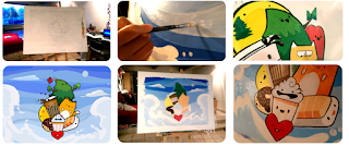
The piece turned out to be ambitious and technically challenging, but we made it work. During the competition, we had our references and strategy detailed on paper. Not once did we pull it out. We went on auto pilot. Everything we did, everything we practiced just flowed spontaneously. And we didn't forget the cherry this time. 

Thank you to everyone who voted for Team 3 and for showing some love to these newbies in the art scene. Big thanks to Lea and Tyler who won the bid. Rest assure we will come together for one more time to clean this up and make it home-worthy for you. 

--Practice doesn't make perfect . It reduces the imperfections. - Anonymous (or maybe pinterest.com)

Wednesday, September 23, 2015

BEAUTIFUL HOME IN THE FOREST - DEER LAKE


I remember telling myself, "What a charming little house peeking through the trees...but there's just so much foliage around! I need to simplify. Thank god for ovals and triangles!" As I worked on this a bit more, the sketch started to re-shape itself and with it, the story behind this painting . It evolved into something bigger, something more than just being a house in the woods but a home in the forest. 

The space that we decide to claim as our home is the same space other creatures call theirs. They have been here first, we just don’t see them. Hidden in this painting is a bear, a coyote, an owl, a squirrel and a bird. Do you see them? They are all around.

This will be exhibited at the Shadbolt Centre for the Arts as part of the Vancouver Urban Sketching Burnaby Exhibition for the Culture Days Event on Sept 26th. The preliminary sketch, concept sketch and value study will be presented along with this original painting to show how this came to be. If you have some free time on the weekend, drop by and get your fill of art, inspiration, color and community!

Tuesday, September 8, 2015

FLAMENCO DANCER

Mad About Flamenco! at The Basic Inquiry Life Drawing Studio and Gallery. I tried a different approach to sketching, keeping the pencil on paper for as long as I can without lifting. It's almost like tracing what you see with your eye and then letting your hand follow along. The first 3 poses were done in 3 minutes and the last two were 15 minutes each. There were times I noticed the edge of her dress tremble as she held these very difficult dynamic poses for us yet she never flinched and always had a smile on her face. Click on the image below for a bigger view!


Wednesday, August 26, 2015

HOLY ROSARY CATHEDRAL

This was a result of a plein air study I did during a urban sketching meet up. I chose the Holy Rosary Cathedral on Richards and Dunsmuir because of it's architecture and the way the light and shadow presented itself on it. It was also another chance to use my watercolor easel and learn something new from life!


It was a bright sunny Saturday morning and I found myself away from everyone in the group. I spotted 2 of my fellow urban sketchers within an eye shot from the 4th floor of a nearby parkade. The vantage point was better than ground level, but location wise was a bit challenging as the parkade walls impeded my vision.


I had to lean out to get a good look. I decided to take a picture of the full view and have it ready when I just needed to quickly look at something. 


Here's a thumbnail working out the composition and value distribution. Working small is a great time saver and it saves your much needed energy and focus for the actual piece to paint.


My objective was to simplify what I saw and target values. Color will be arbitrary.

Things that I learned from this experience:
1) When you see the light and shadows that you like, don't be tempted to change it later when you see another light and shadow pattern form because the light source, the sun, has moved. Take a picture of the scene first and then capture of it by eye as much as you can. The picture can serve it's purpose  when the light and shadow pattern changes later.

2) I used negative space to describe areas where the light is hitting.
3) Stairs adds repetitive shapes and establishes a directional element to lead the eye.

I wasn't happy with the turn out but after all, it was just a study. Right after finishing, I immediately picked it apart, critiquing the areas that I liked and wanted to change. My painting was filled with little scribbles, mostly what I wanted to change.


I worked on the new one, and this time, with a renewed energy and vision. I knew what I needed to avoid doing, what to keep and what to do differently. I took my time and tried to keep it loose and suggestive. When it comes to details though, it's hard to simplify the shapes without losing the overall look. I decided to slowly paint the the smaller designs slowly but not too carefully to keep it suggestive and loose.


Sunday, August 9, 2015

PLACED FIRST AT THE HARMONY PLEIN AIR FESTIVAL

I did it! This next competition took me all the way to West Vancouver. I got lost on the way there and was a bit late. Thank you to Alfonso L. Tejada who advised that I register at the end so I can get started. This challenge took 3 hours and there was no specific theme other than paint anything that catches your eye. The weather was mostly gray skies and thankfully, it only started to drizzle at the end. Thank you Alfonso, Ferry Building Gallery and Opus Art Supplies for all your efforts in organizing this event. The wine and cheese reception after was very different and fantastic!


I tried a different approach this time to use use the white of the paper to describe light. I was uncertain whether this was too much of a subject to paint within the allotted time but time was ticking, so I went alla prima and just prayed that it didn't rain.

 
The view of the boathouse. There was lots of other details, bits and pieces, rocks and logs scattered on the beach. Quite an intimidating subject to start with I think. 


There was cheese and wine after the event too. This was only available to the artists who registered and entered the competition. Look at the lovely spread! It should've been more than enough to get my appetite kicking since I hadn't had any breakfast that day, however, the adrenaline was still going and hunger and thirst took a back seat.


I had an amazing time. It was a unique way of ending the painting challenge. Thank you to Alfonso, the jurors Ann, Tatiana and Maria, and Opus for making all this possible. 


Tuesday, August 4, 2015

PEANUT BUTTER AND BANANA BEAR

Finally it is finished! This still life turned out to take much longer than I expected as it eventually became a challenge on watercolor painting texture. The crustiness of the bread, the slices of bananas, the reflection of steel, the ceramic boots and mugs and the organic leaves and flower petals. 

Below is the original sketch: 


Monday, July 27, 2015

WORK IN PROGRESS SHOTS


Work in progress shot #1: The Cookie Monster song "C is for cookie, that's good enough for me" kept playing in my head as I was painting these. Here's a work in progress shot of them cream filled confections as part of a bigger composition I'm working on.

Work in progress shot #2: I found a yellow ceramic vase shaped like a pair of boots at a local thrift store and immediately saw how much charm it had. The yellow color, the glossy texture, the appealing shape ..and then I dropped it. The cashier charged me a bit less than half of it's original price wondering why I still paid anyway for 8 broken pieces. Well, I had other plans for it and it started with getting myself some supah-glue.


Work in progress shot #3: I had always wanted to paint this knife kebab that someone gave away at work but painting it on it's own would make it look a bit lonely and neglected. This was the perfect composition to add it in and the most fun to do!


Tuesday, July 21, 2015

DELTA GRAND PRIX OF ART

It was another first for me to join an even bigger plein air painting competition. This was just what I needed to get me to go outdoors and paint, otherwise, I'd be indoors...painting the outdoors. I learned quite a lot from painting outside. It allowed me to see more than what a picture limits me to. I was forced to stick with it until the very end, so concentration was at it's highest.  I discovered that  my competitors weren't the other artists. I had a different competition of my own actually. It was a battle between my understanding of watercolors and the environment. The external factors (heat, humidity, wind, dirt, noise) can affect drying time, water to pigment ratio and really shake things up with how I would normally go about my painting process.   I had to work at a whole different pace and make crucial decisions along the way, be confident with them and then just do it. It was as if the surroundings said:  "So you think you can paint? Let's shake things up a bit!"

This is my location along Elliot Street. We had a tent to keep us in the shade and it was possible to share the same tent with other artists who chose that location as well. I had very little choices if I stayed inside the tent. 

This was my view from the tent. The Dragon Fly Gallery. Allan, the owner, reminded me of a wrestler, almost like Jake the Snake Roberts, his long gray hair and a handlebar mustache. But he was a kind soul. He opened his doors to me an any other artist who might need to use a washroom. They opened the two red gates and brought out some of their cool stuff, rustic novelties and collectibles like wooden chests, cement painted birds, old vintage cans, bottles, wine crates etc. for us to paint. It was like a gigantic still life painting to do, however, as you can see in the picture, it was all covered in shade. 

I decided to go outside the tent and made sure that it was within the rules. I could technically go outside the tent but stay within 20 feet from the tent and this is what I saw. There was a restaurant called Sharkey's to the right which is not seen in this picture and a small arrangement of landscaped rocks just a few feet from where I was standing. Others were looking at this too. One of the organizers mentioned that this will be torn down soon and rebuilt into a more structurally sound facility with the same materials. It will become an art studio for children to learn arts and crafts. Now I have a good reason to make this my subject. I didn't like how neglected it looked, with the foliage in the front. I thought of changing that to make it more appealing and more inviting. So I thought of  "borrowing" other elements I saw that would look more interesting and colorful in place of the leaves.  

This building was just a few feet away from the barn. I borrowed the raised platforms with potted plants and flowers, the tree and the black posts. I incorporated that as the front of the barn and did a quick sketch to see how it all fit together.


The event was well organized and seamless. We had a contact person and number to call if we had any questions,  a bottle of water was provided by the volunteers, each of them were well informed and all answered questions well, our lanyards had our designated number, a lunch voucher, a price card to put the painting up for sale after, a raffle ticket and a thin plastic that held pencil led and an eraser. 

There were lots of people who came by to show their support and I received a variety of positive feedback from volunteers of the event, the Ladner community and the public. One gentleman said that he was told by the others to check out "the guy painting at the end of the street". That was very encouraging to hear. 
 
Here's a close up of the barn. I didn't have much space to put my water container and used the top of the fire hydrant as a base. My container was knocked by 3 times! Once by me, and twice by other spectators. They were so kind to refill it for me. One gentleman asked if I wanted water to drink and had his bottled water ready to be given. I politely declined as I came prepared with 3 that he didn't see.

When all was said and done, all entries were framed and hung in the Ladner Community Center gymnasium, for sale. (A huge thanks to Lily for lending me her frame. She had two extra ones and made sure to give me the one that looked best with my painting. I didn't realize I had to bring my own.) I felt a tap on my shoulder and turned around. I didn't recognize the gentleman, but he asked me: "Where's your painting?" I pointed to the corner where my painting was hanging and he and his wife made their way there. He came back to me after and said that he really liked my painting and thought that the colors and style was unique and beautiful. He also mentioned that I was the only one who painted in the street number. I told him the story that I heard from other people which is why the number had to be there. It's a detail that provided character to the building and a tribute to the historic value it represented. 

I didn't win any prize, but this felt even better!


Monday, July 13, 2015

WATERCOLOR BABIES


Well, I just made a couple of babies this week. A commission that was meant as a mother's day present to his wife by my good friend and colleague at Kodak. As we all know, and have experienced in "other" ways, making babies takes a lot of hard work and preparation(!) Two separate solo shots of each baby were used and combined into this one painting. I made several pencil sketches and color tests before I started with the actual one. You will see the color studies I did where I painted the clothes as is and I felt that it was commanding too much attention. So I thought of keeping their clothes "neutral" and splashing the color as the background instead. Where the colors intersect is where their separate identities become that special bond only shared between a brother and a sister, being born at almost the same time.

  
A close up shot of the mouth. Painting babies requires a great deal of concentration and a lot of pigment to water control. It's just not the same as painting an apple.


I used to think that babies were just...pink. But they are also blue, purple, yellow, brown and green in very subtle gradations. The white you see is the color of the actual paper. Those have been carefully left out and painted around.

  © Blogger templates Brooklyn by Ourblogtemplates.com 2008

Back to TOP