Friday, May 20, 2016

WHAT A PLEASANT SURPRISE!


Monday, May 16, 2016

"SEE" FOOD DELIVERY


What a beautiful day to just paint all day long. This is a color study of one of my paintings in the making! I call this: "See" Food Delivery. What do you think the little seagull is thinking about?

Sunday, May 15, 2016

BEHIND THE SCENES: CULTIVATE LOVE

And here is the culminating post of the project. Check out this 2 minute behind-the-scenes documentary I post-produced: 3 Artists bringing color and life to a wall in a basement parkade of a senior's home in Vancouver. Props to Dansonn Beats for permission to use his song, Carry On, which had just the perfect blend of rhythm, texture and crescendo that lets our story sing. As the name of the song goes, on to the next project!

Check out the talented artists whom I collabed with here:
Art + Soul Creative Co. and Janelle Anakotta

Friday, May 13, 2016

MURAL PROJECT: CULTIVATE LOVE

                                
                                     "Work work work work work" - Rihanna

Thursday, May 12, 2016

MURAL PROJECT: CULTIVATE LOVE


When lying down on the job is the rule and not the exception. Slow and steady but progressing quickly.

Tuesday, May 10, 2016

MURAL PROJECT: CULTIVATE LOVE


What's better than having a brush to paint with? Having 2 of course! I have joined forces with two talented artists, artandsoulcreatveco's Laura Uy and Janelle Anakota to paint this mural for the Seniors Baptist Home on 3rd and Commercial drive. This is a work in progress shot (which is why the colors are subdued for now) and I will slowly reveal the wall in its fulll glory as we get closer to the end.

Friday, April 29, 2016

PAINTING PRACTICE

I painted before I slept and painted when i woke up in the middle of the night. I'm trying a different style as my break in between projects, teaching myself a faster way to paint, figuring out how to do watercolor shorthand. It's like learning how to write. I will eventually find my own strokes and when i do, I sure hope it will turn out better than my penmanship!


Sunday, April 17, 2016

STAIRWAY TO PAGODA

A watercolor sketch of a pagoda situated within a balanced landscape of hard and soft, rocks and plants, at the Sun Yat Sen Garden. It was a muggy chilly day but I still would have wanted to stay longer. Nevertheless, it was a welcome break from my studio painting. I had a bit of fresh air, was in the good company of the Vancouver Urban Sketchers and I walked away with a study I may come back to and develop later on.

Sunday, March 20, 2016

SOLD!

A Beautiful Home in the Forest - SOLD! I am happy to say that its new home is now in New Zealand. (It got there before I ever would!) A new chapter has unfolded in the life of this painting and its story will continue to be told in the words of somebody else. It was one of my favourite pieces but I am not sad it has left my hands. Its message can now be seen and heard by more people. I bid you farewell my precious painting and Kia Ora New Zealand!

Monday, March 14, 2016

COMMISSION: BRENDA'S CAMINO


This painting was commissioned for my dear friend Brenda whom I met on my trip to the El Camino de Santiago.

This picture was my first day on the Camino and Brenda was among the first group of people I had met on my journey.
It was a secret birthday gift instigated by Wendy, involving Brenda's husband in Saskatchewan and her sister, Dee, as the accomplice, denying all knowledge of this in the making until right after the moment of revelation. 

This was when we all reunited for one night in Vancouver. It was a small get together of friends on the Camino. They were the only three I knew at the party but it was as if I knew everybody else. The spirit of the journey was still in each of us.
The figures in the painting are part of an installation found on top of a hill on the Camino called Mt. Forgiveness. This was a memorable spot for Brenda so I thought it would be even more meaningful to her if I painted her in it. The second figure you see in this painting is Brenda. 
Inscribed on the actual sculpture that this painting was based on reads: "Donde se cruza el camino del viento con el de las estrellas": Where the paths of the wind and stars meet. I am turly honored to have been given the chance to paint this for her. Wendy, Dee, Brenda and I had been brought together again for one night only, creating another special occasion, another lasting memory, all because we took a long walk together some time ago, somewhere north of Spain.

Wednesday, March 9, 2016

MY HOME, YOUR HOME

MY HOME is our acknowledgement to the city we live in. YOUR HOME is our acknowledgement of the animals living with us. There are other characteristics of the city represented in this painting. Another one would be the colors I had carefully selected: Blues, Purple, Browns and Green...because we get rained on 3/4 of the year. Can you guess what else says "Vancouver" in this painting?


Saturday, March 5, 2016

WORK IN PROGRESS: VANCOUVER


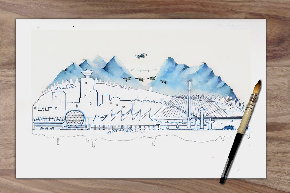
Third section done! This section introduces more detail balanced with spaces of simplicity for the eyes to rest. Brushstrokes vary from straight hard edges of the buildings, curved edges of the rocks, random suggestions for foliage, and finally a smooth gradient wash for the water.

Second section done! I felt that something in this section could use a bit more interest. Can you spot the change I made to this version vs the original sketch?
                   First section done! Do you see the big letter hidden in the painted section?
Next project in the making is going to be a big one: 19"x27" in watercolor. This is the sketch of the composition: A collage of scenes with mini-stories hidden within. A huge undertaking as lots of planning and preparation is involved to control the pigment and water. My workflow usually starts out very technical: Measuring, adjusting, testing and finessing but when it's time to put brush to paper, I am 5 steps ahead in my head but I am also ready to go with the flow.

Sunday, February 14, 2016

AMOUR


                           "What word would you think of when you think of Paris?"

I wanted to explore and capture the essence of the city so I posted the question on my Instagram account to involve others and I got a few suggestions.
 

I also had other suggestions from a friend of mine who was born and raised in France: Fabuleux, Merveilleux, Fantastique. While they were all good suggestions, I had yet to find one that resounded with me. Then one night, while at a café with a good friend of mine, I mentioned this project to him and what he said next immediately struck a chord. I saw images on my sketch. What they looked like and where it was going to be. The funny thing was, what he said wasn't even French nor was it just one word. They were two:                                                      French Kiss.


The most passionate of all kisses where it starts with the lips touching and the...well, you know the rest.


                          There was something about "French Kiss" that clicked.

                    It wasn't so much the act of French Kissing, but what was behind it.


Two people, sharing a wonderful moment, on a bridge, stopping time, somewhere out there in a city called Paris. This was what I saw.

It represented my trip to Paris, all the trial and errors,  all the risks taken to make the first version work, the positive feedback and encouraging words I got from the spectators and the vision that pushed me to do another one with a more personal touch.  This was what I felt.

                                    It is Amour. That was what resonated with me.


Saturday, February 6, 2016

WATERCOLOR SKETCH

This was an experiment on values vs. color. The reference photo I used was a black and white so there was no way I could be influenced by hues. I came up with my own color palette and focused on targeting the different values that I saw. I was using a different watercolor paper as well, so, this exercise was totally out of my comfort zone. It was one of my off the cuff studies that turned out quite well.

Saturday, January 23, 2016

JASON AND WENDY


This was a sketch that didn't go much further to a level of studio portraiture or painting. However, it was framed and gifted to Jason and Wendy for their wedding present. There weren't a lot of pictures available to choose from but this was a product of three separate photos combined into one.

Sunday, January 17, 2016

THE MARRIOTT HOTEL


       The next project, I  and a friend of mine,  were commissioned to  do a 3ft cx 4f paint-
       ing, live, at the Marriott hotel in  Vancouver for their customer appreciation night. The
       medium: Acrylic paint on Canvas. The theme was international  skylines: Vancouver, 
       England, Paris and New York.  I chose Paris, because I just came back from Paris 
       not too long ago and my painting partner lived in Paris for a few years.  

       The challenge: Incorporate the Marriot and Renaissance logos in the piece.
  
        We only had three days to prepare. Painting in acrylics is very different     
        from painting in watercolors but I thought I’d make it look and feel like
        watercolors.

        When I tried to do it on canvas, I ran into some problems:

        1) I couldn’t get the acrylic paint to look like watercolors.
        2) I decided to use watercolors. (Approved by the organizers.)
        3) The watercolors kept dripping down the canvas.
        4) The white paint was not runny enough to make streaks.
        5) The internet had nothing about using watercolors on canvas

        It was a big risk to take but if I could somehow find a way to make it work,
        the result would be very different and really cool. So, I developed my own
        technique overnight, researched and drove around the city to find the
        special paint for the white streaks and then taught my painting partner the workflow.


We only had the next day to practice together. It worked. However, the last 
detail, the paint for the white streaks still didn’t have the right flow. It was 
just dropping dots instead of thin thread like strings.
 
When I got home, my landlord left a bucket of paint for me. I messaged him 
earlier in case he had the paint I was looking for, and luckily enough, he did.
I tested it and it worked exactly what I had envisioned. 

This was the result.


The event was huge. Check out the motiff:


This was our station: 


I had been asked if the painting was up for sale by 2 ladies who worked for the hotel. They were interested in buying it, without the hotel logos they said. The president of Marriott came up and was impressed just knowing the technique behind the crisp edges and the controlled drips of paint. I had the chance to talk to him and explained the concept: The building in the middle is their biggest location in Paris. It is an icon, side by side with other Parisian icons. The balloon also has the logo on it. It signifies no limits, flying, going places, all over the world. He was pleased to hear about the research and thought put in and the story behind the art.  He shook my hand. I was told by the organizers that same night, that it was gifted to their top vip client. 


Although the hotel was the focal point, people saw and felt something beyond that and connected with the painting. The beauty about art is that it reveals your thoughts and impressions. It reflects your feelings. It mirrors who you are. It shows you, you. 

It was a successful night and I had a taste of what this could be like if I could paint full time. It only serves to motivate me to work harder and develop an exit strategy from the day job.


Thursday, January 14, 2016

THE LAST BOW


I don't know where I'm going from here, but I promise it won't be boring ~ David Bowie (R.I.P: Rockin' In Paradise)

Sunday, December 20, 2015

A DAY IN THE LIFE OF A CAT

 
"You have a visitor behind you...", "They are affectionate whenever it's inconvenient for you, like when you're doing homework..." , "C'mon let's go find a cat!" Those are some of the conversations I overheard while at the Cat Cafe.
 
I don't own a cat myself, but I was curious to see what the very first Cat + Cafe looked like since I made reference to the "Catfe" on one of my instagram posts about a Cat character named Furnando that I created for a painting competition:
The place is actually a cafe and adoption shelter. There were seven resident cats that were carefully selected from the SPCA. The requirement: They needed to be the friendly ones. I was on the waiting list for walk ins as reservations were necessary to regulate the number of people coming in without causing too much stress on the cats.
When my name was called, two other cats were called as well. They had been successfully adopted! The entire wall on one side looked like one long shelf of hollow squares with holes for the cats to pass through. It was where they slept if they chose to and played if they didn't feel like coming down.
This is Jose. He's a black and white cat with a pink nose and he's very laid back. He became the subject of my painting. As I spent my first hour thinking about how to capture the essence and vibe of the place, I watched and interacted with the cats and took some pictures.
The concept that I thought of was to portray the life of a cat in the cafe by using the cubby-squares as the back drop. To ensure that the boxes don't look like cages, I did two things:  The holes that they passed through had to be visible within the perspective that I drew it in. The second was to draw a cat walking through 2 of the boxes. 
The cats you see are images of just one cat. The color doesn't represent the cat's fur but it's temperature, ramping up from cool and calm to active and alert and back to just being chill. Click on the image to view a bigger size. 

Sunday, December 13, 2015

THE BEER AND THE BEAUTIFUL

The Vancouver Urban Sketchers was at the 33 Acres Brewery Pub joining the crowd for some onsite sketching, drinking and food. It was a rainy Saturday afternoon and the place was buzzing with activity.


I didn't have any lunch yet so a doughnut and coffee was all I could get. This was an earl grey's doughnut with what I thought were chili flakes. They were actually fresh rose petal sprinkles.
This was the beer paddle ordered by a couple of urban sketchers. It's a good way to sample different flavors and hop levels. 

I couldn't stay too long as I had an appointment to keep, promising my 6 year old nephew that I'd come over to play video games with him. I painted just two beers and planned on finishing it when I got home. It was a long day for me and arrived home at about 1130pm. I must have caught a second wind since I was wide awake and could not wait to paint. So that's what I did. After my nightly rituals, I set off to paint at around 1245 and took my time. I believe a pizza was ordered and consumed in between and I finished at around 430am.


Saturday, December 5, 2015

HANGING OUT AND HANGING UP!

Somewhere in Vancouver, on a Friday night, a "Hang Up" party was happening. 

Backtrack to a week ago, we were invited by our buyer and friend, Lea, to her home for what she called a Hang up" party. It's a small gathering of friends, snacks provided, for the unveiling of the painting that we did live in 80 minutes, at the Battle of the Brushes competition in November. I was pleasantly surprised to know how she created an entire event just to welcome the painting in her home. I was more than happy to come by and see it all unfold.
On the night of the party, upon my arrival, this long brown fabric draped over the painting was in the center of the living room. I brought with me an envelop with an original Certificate of Authenticity and colored print of the "behind the scenes" chronicle of the painting.
We had the chance to tell our story to everyone, how the idea started, the revisions and versions that it evolved into, how my painting partner and I started working together, our journey from joining this competition being handicapped from having totally different styles , and never having tried painting in acrylics.
The "behind the scenes" chronicles was passed around the room and it was just a privilege as an artist to see and witness the moment when your art is seen in this regard, hearing the response and interacting with the people. 
I was so glad to be part of this reception. She added that the painting will help warm up the place and get them through the cold winter season. 
 Here's a 15 second video I made of the unveiling.


If this one painting can make two people smile, why not make another one? A bigger one, but this time, getting more people, the people of Vancouver involved in the making of the painting.

  © Blogger templates Brooklyn by Ourblogtemplates.com 2008

Back to TOP